From Novel
to Graphic Novel
Adapting prose into sequential art is not a reduction. It is a translation, and translation requires you to understand what the story is actually made of before you can decide what form it wants to take. This is how I approach that work: the thinking behind the images, the decisions behind the pages, and the instincts built over years of making both.
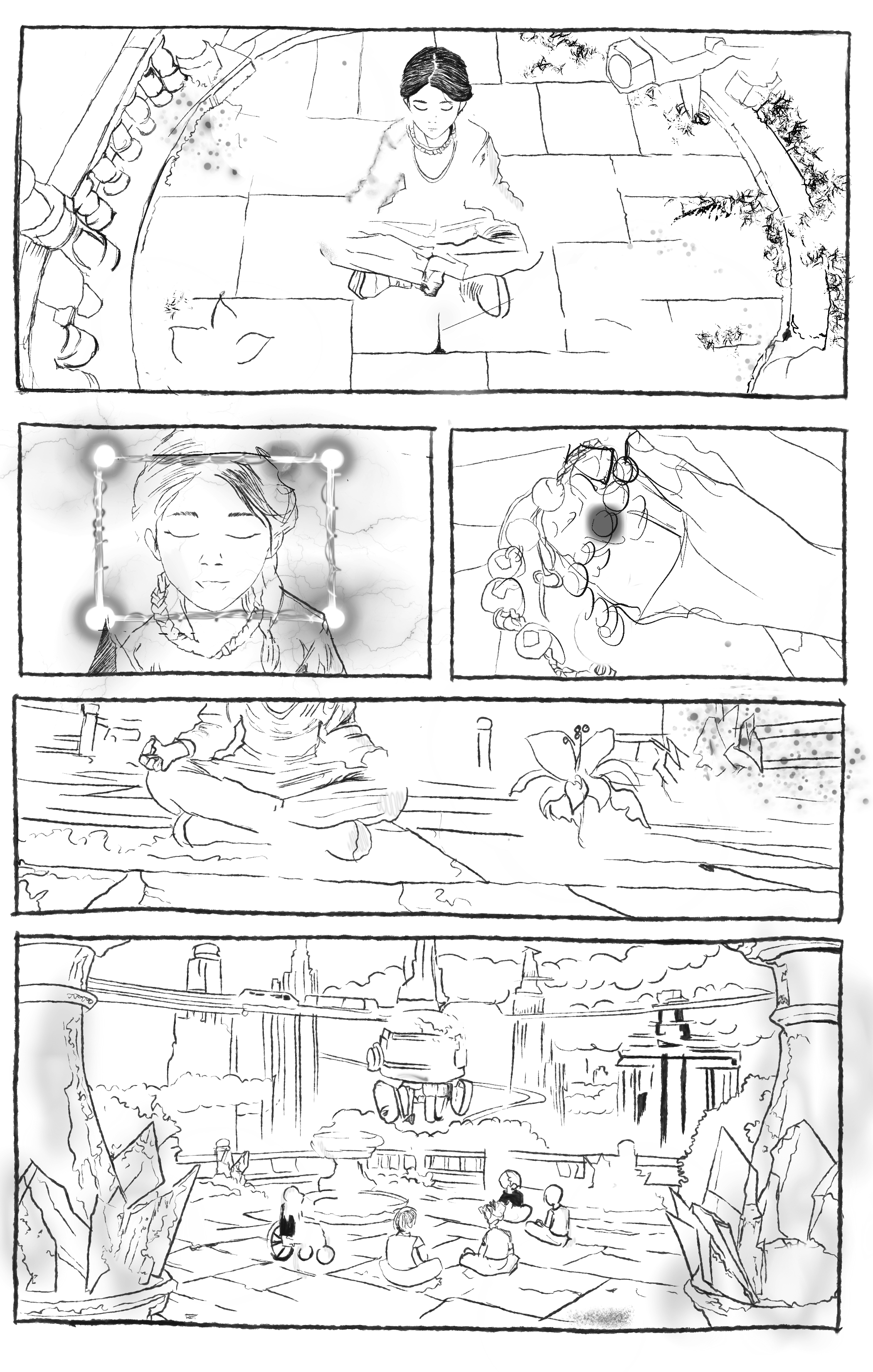
"She stood at the window for a long time, watching the city below arrange and rearrange itself, not knowing whether the tightness in her chest was grief or something closer to relief."
The novel holds interior states in language. The reader lives inside the character.
Wide shot, high angle. Her back to us, face unseen. City lights blur below. Her hand rests flat against the glass. One panel. No caption.
The graphic novel makes the reader look. The silence between panels carries what prose speaks aloud.
Adaptation is not reduction
People assume moving from novel to graphic novel means cutting the story down. It does not. It means finding the truest visual form for what the story is already doing. A scene that takes two pages of prose might take one panel, or it might take eight. The length was never the point. The impact was.
Images carry meaning prose cannot
A novel tells you a character's face went still. A graphic novel shows you. The silence between panels, the weight of a shadow, the way a body holds its tension are not illustrations of the text. They are the text. I am not decorating the words. I am finding the images the words were always pointing toward.
The page is a decision, not a container
In prose, pacing lives in sentence rhythm. In sequential art it lives in panel architecture: the size of a moment, the silence between beats, where you force the reader to turn the page and what they discover when they do. Every layout is an argument about what matters most in that scene.
Read it twice: once as a reader, once as a director
The first pass is pure feeling. What scenes stay with you after you close the book? What images does the story keep reaching for? Where does time slow down? I am not making decisions yet. I am listening. The novel already knows what it wants to be. My job is to hear it without opinion.
The second pass is forensic. What is the visual DNA of this story: the world, the light, what each character's body says before they open their mouth?
Do not start with favorite scenes. Start with the scenes that prove what kind of story this is.
Find the visual DNA: world, character, motif
Before a single panel gets drawn, I need to know what the world looks like, what it values, what it hides, and what it repeats. Architecture, materials, light sources, recurring symbols are story information. A world that is fully designed tells the reader something true before anyone speaks.
Character design happens the same way. I start with role and emotional energy, not costume. If I cannot identify a character by silhouette alone, the design is unfinished. The body should tell the story before the face does.
Worldbuilding is not background filler. It is story information in visual form.
Choose, cut, and combine with ruthlessness and care
Adaptation is selection. This is the hardest part, not because cutting is painful (though it is), but because you have to understand what the story actually needs versus what you are attached to. I make three lists: Keep, Combine, Cut. Everything that stays must earn its place in the visual version. Some scenes essential in prose become redundant in images. Some single lines of description deserve a full page.
Cutting is not betrayal. It is structure. A stronger adaptation almost always has fewer, sharper scenes.
Build scene order for rhythm, contrast, and the page turn
The order of events in a novel is not necessarily the right order for a graphic novel. Sequential art lives by the page turn: that moment when the reader's hand moves and their eye lands somewhere new. I sequence by contrast: calm then disruption, clue then reaction, mystery then reveal. If every page hits the same register, the reader goes numb.
The opening is its own problem. The best first page is not just the beginning of the story. It is an invitation: the world is here, the stakes are real, keep reading.
Page flow is about the reader's experience, not just the order of events.
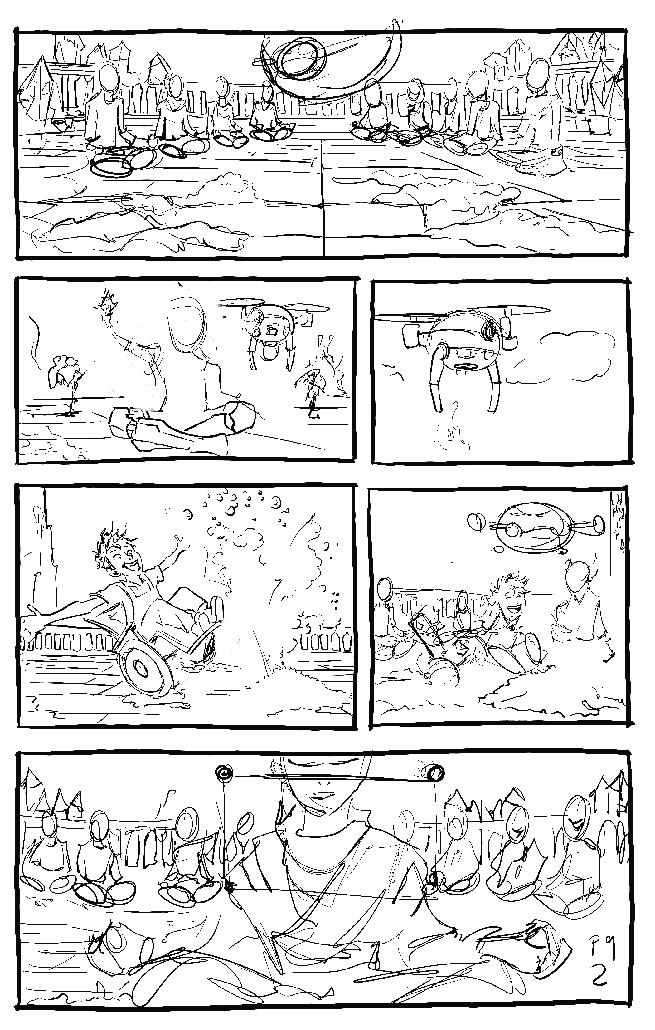
Thumbnail fast, stay rough, test compositions
Thumbnails are not small finished drawings. They are fast visual decisions. I reduce each scene to three to five big shapes, test where the eye goes first, and try at least three versions before committing to anything. The goal is not beauty. It is storytelling clarity. If a scene works in a messy thumbnail, it will work at full size. If it only looks good finished, it never really worked at all.
Messy thumbnails still count if they help you think. Clarity before beauty, always.
These pages remain intentionally rough. At this stage I am testing rhythm, emphasis, and visual continuity rather than polish.
Let the words do only what the image cannot
The hardest editing discipline in sequential art is cutting text that the image has already handled. Dialogue should carry voice and tension. Captions should add perspective or memory, not describe what is already visible on the page. Silence, used with intention, is often the most powerful choice available.
I always cut harder than feels safe. The image usually has more to say than I first give it credit for.
Sometimes the strongest line is the one you cut. Trust what the image is already saying.
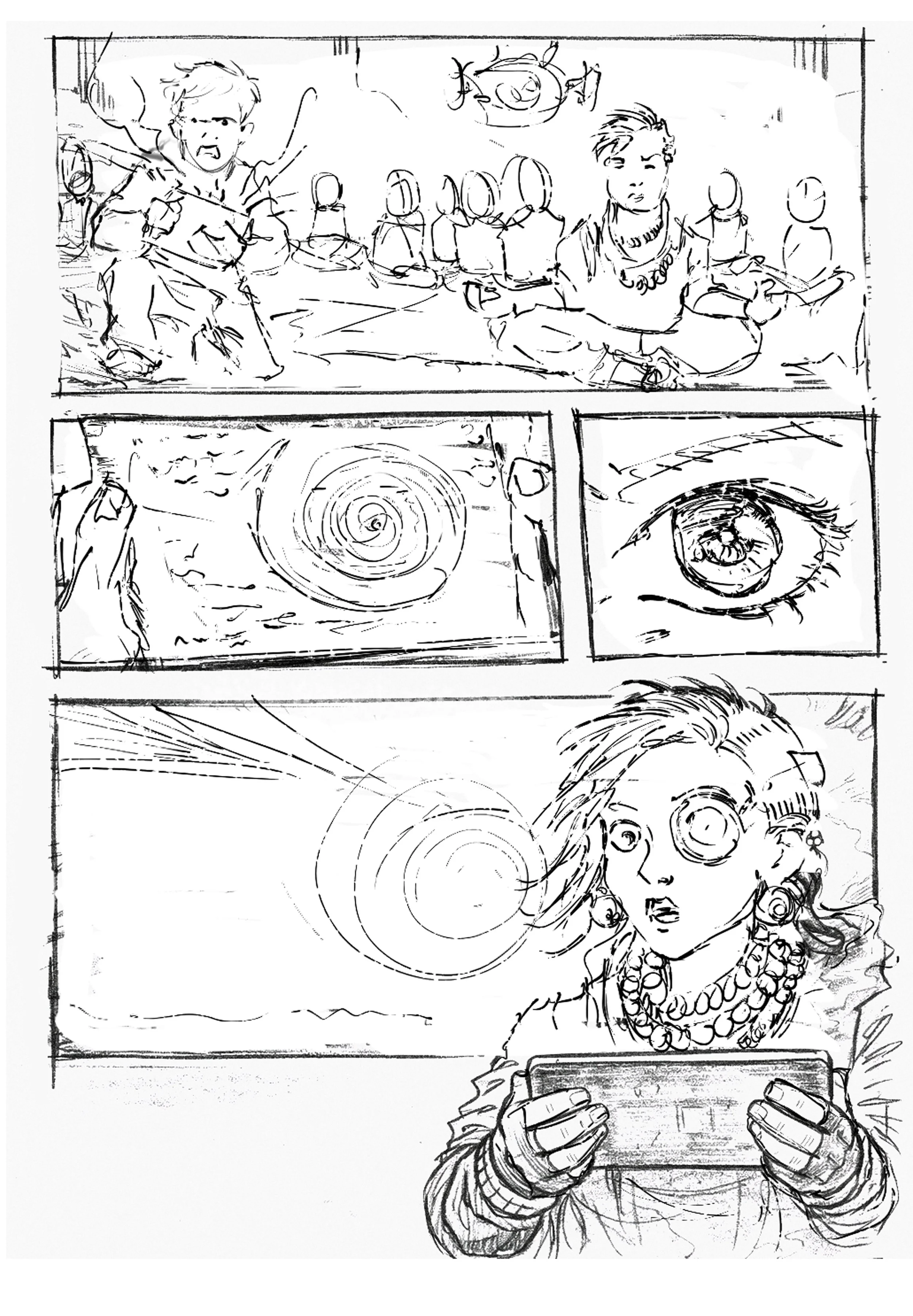
Pacing is architecture. The number and size of panels is not a stylistic choice — it is an emotional argument. Every count is a decision about how much time the reader spends inside a moment.
A single framed moment. One action, one beat. The fundamental unit of sequential storytelling.
The space between panels where time passes. The reader's imagination fills in what happens between one moment and the next.
A full-page dramatic image. Used for major reveals, openings, or emotional peaks that need room to land.
Two pages viewed together as a single unit. Used when the story demands maximum visual scale or impact.
The moment the reader physically turns the page. The most powerful structural beat in sequential art: the ultimate hook.
A moment of pause or emphasis, often a silent panel. Beats slow the reader down and create emotional weight.
A text box carrying narration or inner thought. Not a description of what is already visible. A caption should add what the image cannot say alone.
The full visual plan of the story in sequence, before final drawing begins. The bridge between script and finished page.
A small, rough sketch used to plan page layout and composition. Not meant to be beautiful. Meant to make decisions fast.
A wide panel that shows the environment before the action begins. Tells the reader where they are and what the world looks like.
Empty or undetailed space used deliberately to create mood, focus, tension, or visual breathing room. Emptiness is not nothing.
Artwork that extends to the edge of the printed page with no border. Creates a sense of the image escaping its frame, often used for intensity.
Mood is designed, not discovered
The emotional weather of a scene is a series of deliberate choices: composition, light, spacing, shadow, texture. If you wait until final rendering to think about mood, you are already too late.
Symbols earn their place through change
A good visual motif does not just repeat. It evolves. The object or image that opens the story should mean something different by the end, not because it was announced, but because the story earned it.
Sequence is how the reader arrives at meaning
A graphic novel scene is a chain of discoveries. I break prose into action beats, information beats, and emotional beats, then decide which need a panel, which need silence, and which should not be shown directly at all.
Protect the story, not the prose
The goal is not to preserve every sentence. It is to preserve every truth. Those are not the same thing, and knowing the difference is what makes an adaptation work rather than merely exist.
"A graphic novel scene is a chain of discoveries, not a block of explanation. The reader should arrive at meaning, not have it handed to them."April Martin · Purple Inkwell Studios
Working on an adaptation?
If you are building something difficult, especially the part you are afraid to write, I would love to hear about it.